Wix Tutorial: Build a Website in 7 Minutes [+ Videos]
[Updated on 6/29/2023 with the changes to Wix's program.]
Regardless of whether you consider yourself tech-savvy, allergic to technology, or somewhere in between, the idea of building your own website can be daunting. Wouldn’t a website tutorial be nice? What about someone walking you through step-by-step? What if we could have helped you create your website in one hour? Dream no more. Enter, our free Wix tutorial!
The first step is to click below to open Wix in another window (this is free):

Got your window popped up so begin creating your website? Great. We'll walk you through it.
A Wix Website in 7min
I’ve been playing around to learn the ins and outs of Wix so you can hit the ground running. And good news for you, it is shockingly easy to build a professional-looking site with our Wix tutorial!
To prove it, here's a sped-up view of how it took me less than 7 minutes to set up a website. 6 minutes and 36 seconds to be exact. ⏱
Now to be fair, I didn't fill my website with content but the fact that you can set up a gorgeous looking website so fast is A-MAZING!
Not sure if Wix is for you just yet? See other options in our Travel Agency Website Option article!
Website Prep: 4 Items to Have Before You Create a Wix Website
Before we dive in, let’s make sure you have everything you need to breeze right through this Wix tutorial! Even with fun and easy templates, it's a good idea to have a general idea of what you might want your site to look like.
1. Your Logo: Easy enough. (If you don't have a logo yet, Wix also has a program to help you create a DIY logo!)
2. Brand colors: If you want to use the colors of your logo, you can upload it to a program like Adobe Color (it's free!) to pull the exact color codes from your logo.
3. Some content for your site: If you have a general idea of what you want for your site in terms of layout, pages, and content such as photos, videos, or text (like a company or personal bio), that can help get you started.
4. Your Social Links: You can always add later but it's nice to do it all in one go!
This will help you get started. You can always go in and fill it in with more content down the line once you have a better grasp on your site.
Don't have all of the above? Be sure to read our How to Make a Website From Scratch guide for site structure tips and must-have pages.
Step 1: Set Up Your Wix Website Account
Remember, we’re going to be doing this together. Our first step? Click below to create your Wix account (if you haven't already!):

If you are new to Wix, you'll have a couple of multiple-choice questions first, those are:
- Who do you want to create a website for? (Myself/My Business)
- Have you created a website before?
- What kind of website do you need?
If you already have an account, the link will just bring you to your account dashboard where you can create a new site (which we recommend if you're following this tutorial!)
More of a visual learner? We made short videos for all of the steps of this tutorial.
In order for Wix to set up your site, it will prompt you with a few questions and prompts to learn about your business. Here’s what you’ll be asked (and how you’ll want to answer):
What type of website do you want to create?
Type in your business’ focus. Since we’re working mainly with travel advisors, this is where you’d put “travel agent” or “travel agency”. They even have other suggestions such as “Cruise Travel Agency”, “Dive Travel Agency”, “Travel Blog”, “Consulting Agency”.
Business Details
Next, they will ask you for your business details like your name, address, hours, and staff. You should have your name by now but if not, our travel agency name article will walk you through it. You can skip sections you're unsure about and update it later in your Dashboard! You'll also be asked if you want to add any services. I would advise leaving this blank for now unless you're sure you have a service that is integral to how you'll operate your business (like having classes).
Wix will also show you some of their "useful tools" and allow you to select ones that apply to you. Two of those options will be to accept online payments and to accept in-person payments. Before you get ahead of yourself and think that means you can accept payments for trips, you'll want to read our Credit Card Processing 101. Spoiler alert: it isn't that easy for travel advisors as we're considered a "high-risk industry". Again, I would also advise skipping this section - you can update these later in your dashboard.
Once you have your business details in, you'll be brought to your dashboard where you'll see the information you've entered so far. Click the Design Site button to get the fun started!
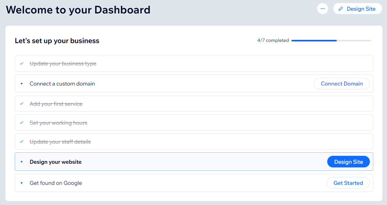
You will have two options for how you want to design your site: let Wix create a website for you or pick a template to customize. This tutorial is for the first option which we feel provides a more custom experience while preventing overwhelm by walking your through the process step-by-step:
1) Review and Edit your info
There are a few things you will do in this step of our Wix tutorial:
- Upload your logo: I would highly recommend having your logo before you start this process. This allows you to choose a theme with coordinating colors which is crucial to making a well-designed website!
- Enter your contact info
- Connect social profiles
Always remember you can come back to add or edit things. Don't procrastinate setting up your website because you don't have your social media accounts set up!
2) Pick a Theme
Wix will provide you with six themes to choose from. There are more themes you can browse through later and you can customize a theme's colors and fonts. Wix is trying to steer you away from analysis paralysis in order to get a professional looking website up ASAP. So instead of being bogged down by fonts and colors, you can choose a cohesive theme so your site looks gorgeous from the get go and customize later if you want.
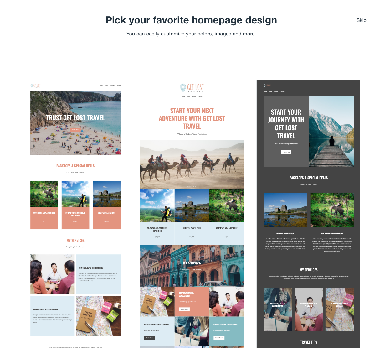
3) Pick your favorite homepage design
Using the theme you chose, Wix now provides you with three homepage design options. You can scroll up and down to see what each looks like. Much like everything else, you can always change the design and layout later if you decide you don’t like it.
4) Add Pages
The pages Wix is choosing to show you are based on the business type you entered at the start. Since you presumably said travel agency, you likely have page options like destinations, request itinerary, and reviews along with more generic (but essential) pages such as about us, contact, and FAQ. Simply check which ones you want to start with. Just like with the previous options, you can add more and different pages later and adjust the design of the pages you do choose.
5) Waiting…. Waiting….
It takes just a bit while Wix creates your custom site, which makes it a good time to check in with you! Are you still with me? We’re doing this Wix tutorial step-by-step together, right? Good! Once Wix has it set up, you'll see an option to edit your new site!!
And… do you see it?!? Just like that, your beautiful new site is created. But there’s more to do. Let’s keep this Wix tutorial going and help you fill in the content.
Wix Tutorial: How to Design and Edit Sections
Now comes the REALLY fun part - editing your brand new site! It isn't nearly as scary as it sounds as each page is made up of sections or strips. That’s it! We'll be repeating the same edit and design process over and over again with different sections.
These sections can be edited and designed independently of each other. 1 They can be rearranged, duplicated, deleted, and even moved to a new page.
Here is the Section Design Wix Tutorial video for you visual learners!
As you move your mouse over your page, the different sections will be highlighted in blue and you will see two options appear:
- Quick Edit - This is where you can quickly change the text and/or images - no moving things or getting fancy, just the basics.
- Layout - This will show you a TON of variations of how this section can look - think rearranging the text and image placement, shape, and size. You can click through them to see what each would look like on your site
Want more customization? Double click on the section to get into the nitty gritty options. You'll see options on the top of the section which will vary depend on the type of section. While you're in this edit mode, you can also double click on the individual elements (text boxes or images), and will be rewarded with more design options.
A warning - you can really get lost in the weeds so I would only recommend further customization if you have a specific look you are trying to accomplish. If you go into the heavy customization, there are so many options that you can go down a rabbit hole of tweaking your website FOREVER.
How to Edit SEctions on WIX
Each section has different content depending on the section design you chose. Some examples of the fields you might see are titles, subtitles, media (images), description, buttons, forms, and lists.
When editing a section, not only can you change the content out but you can also turn items within the section on and off. For instance, if you don’t want a button in a section, you can uncheck that field and it will go away. Like magic ✨!
Images & Files
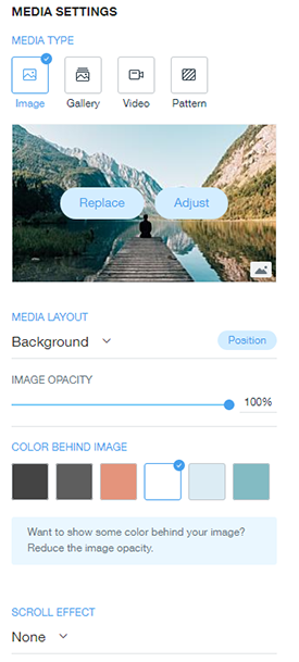
If you want to edit the current media item or want to change it out altogether, just click “edit & replace”. This will bring you to the Media Settings where you can choose the media type you want: image, gallery (multiple images), video (fancy!), or pattern.
Depending on the media type chosen, you’ll see a variation of these options
- Media Layout - how you want the media to be placed
- Image Opacity - lower the percentage to make the image more transparent.
- Color behind image - this only matters if you’re going to make your image transparent with the image opacity. If you lower the opacity, your image will take on the shade of whatever color you choose here.
- Scroll effect - what the image does as you scroll by it.
It’d be tedious to go into every image option so I encourage you to play around! Changes are instantaneous so if you don’t know what something means, click on it and see what it does! Dislike it? Click the undo button!
For the media item itself, your options again depend on the media type. Here is a list of options you'll get depending on the media type.
- Image: Replace or Adjust
- Gallery: Organize Media (choose which images you want in your gallery)
- Video: Replace
- Pattern: Replace or Color
Adjust
Adjusting an image opens up a whole mini photo studio with a pretty impressive collection of photo editing abilities. You can crop, enhance, filters, adjust, cut out, text and background. I consider this another neat feature if you have a specific need but most people will likely not used it.
Replace
Now let’s say you want a different image. When you click to replace it will open up Wix’s Media Manager. This is the place where you can easily add, organize, manage and search site files (images and files you’ve uploaded) as well as gain access to Wix’s media library.
Wix has three libraries to for both free and paid images and videos:
- Wix library - Free images and videos
- Shutterstock library - images and videos for a price
- Unsplash library - Free images, no videos

They also have a “My Boards” tab which is another super useful feature. As you’re scrolling through images, you might find one you like but not for this particular page. You can create “boards” to save and organize different photos you like for future use.
“Replace” for a pattern will show you different pattern options.
Want more ways to find high-quality images, read our guide to finding free, high-quality images for your website
Organize Media
Shown if you choose gallery, this will bring the gallery of all your site images. You are able to edit the title (alt text), description and link for each individual image. You’ll also be able to delete and/or add images.
Color
This is only an option if you choose pattern as your media type. It will show you various color combos using your content and chosen pattern.
Section Options for WIX
In addition to edit and design, each section (besides header and footer) have a few other options:
- Duplicate — Duplicates the entire section (design and content) to the same page
- Move to — Takes that entire section and moves it to another page of your choosing
- Delete — pretty self-explanatory here. Deletes the entire section
Each section also has arrows in the upper right hand corner. These allow you to move a section up or down one section.
Adding a Section on WIX
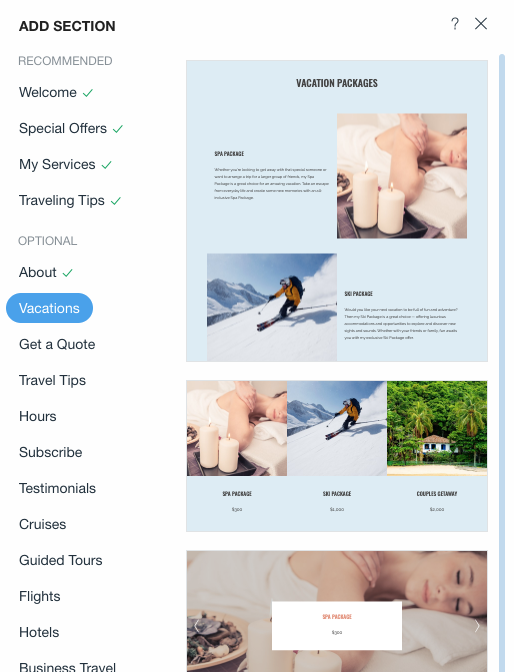
To add a section you can either use the Add feature in the top bar or just click one of the big blue plus signs that shows up as you roll your mouse over sections on the page.
Let’s do a quick example where we go through the process:
- Click the "+" to create a new section on the page.
- Choose a Section Type — You’re shown different types of sections first based on the type of business you selected. There are some great ones for travel agents (like traveling tips, get a quote, vacations, etc.), but just like the apps, careful to only select sections you already have content for.
- Choose a Design — After you choose your section, you’ll see thumbnails for lots of different design options. I love that it has text already in there. It is just default text so you should change it but it makes it so much easier to decide if you like how something will look when the text is pre-entered.
Once you’ve selected the design of the new section, it gets added to the page! You’re immediately brought to the edit area on the sidebar for your new section and can go through the edit and design options we went through above!
Every time I add a section I can’t help but think of those childhood games where you can mismatch different eyes, noses, and mouths. Except with Wix, all of the parts go together seamlessly rather than making a ridiculous giraffe/whale/moose hybrid 😂
Wix Tutorial: How to Create Pages
I love the simplicity of creating pages in Wix. A new page is really just a grouping of different sections. After you select the layout of your new page, you’ll be able to go in and add/edit/delete sections to make it just how you want it.
Adding a Page On WIX
Very similar to adding a section:
- Click the “Add” feature in the top bar then choose “Page” from the drop down. This will open up a sidebar listing all the page types you can add.
- Click on a page type to see different thumbnails of the design options for that page (just like when you choose a section). You can always choose “blank” if you want to create one from scratch.
- Select whichever thumbnail you like and the page will instantly be created.
- Edit your sections like we’ve done before!
Remember, you can rename, duplicate, delete, set as homepage, and see "page SEO" in the “Page” drop-down in the upper left-hand corner. You can reorder your pages by clicking “Site Menu’ located in that same area.
Edit Page Settings on WIX
After clicking the Page drop-down in the upper left-hand corner, you’ll see all the pages of your site listed. Each page has a gear next to it where you’ll be able to access that page’s SEO, rename, duplicate or delete it. You can also choose to make it the homepage.
Organize Pages on WIX
In the Page settings area, click the hyperlinked “Site Menu” text. From here, you’ll be able to drag and drop your pages in the order you’d like. This will change the order of your pages on the menu bar.
There are some duplicate options from the Page Settings but there are two very important new options: subitem and hide a page:
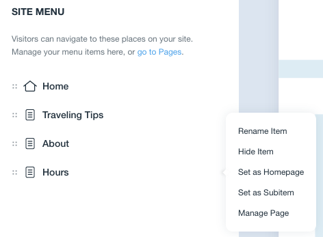
Subitem is how you ‘nest’ a page below another page. Perfect for grouping like pages and for keeping your menu bar less cluttered!
Let’s say I want to put the “Hours” page under “About Us”. I simply drag the Hours page directly under the About Us page, click the 3 horizontal dots on the Hours page, and select “Set as Subitem”. Bam! Hours is no longer on the main menu bar and now shows up when you hover over “About Us”.
Hide Item is exactly what it sounds like. If you’re working on a page but it isn’t ready for the world yet. Or maybe it is a special page that you only show at certain times (think events, holidays, specials, and the like). You can keep the page and all the hard work but hide it from being listed on your site.
Mobile View
I love that Wix has this feature. Your Wix website is already mobile responsive (meaning it automatically sizes to be viewed on mobile and tablet devices). This feature allows you to easily see how a certain page looks on mobile or desktop.

Better yet? You have specific design options for mobile. So if you don’t like how the desktop design for a section converts to mobile, you’ll have options that will change the view just for mobile!
Wix Tutorial: Site Design
Remember I told you you’d be able to change almost everything you selected in the setup? This is where you do that.
Click "Design" in the top edit bar. The options are almost all the ones we’ve seen on the section design level but changing them in this area will change things across your ENTIRE site!
- Themes — If you didn’t like the themes you were shown during setup, you can find more here. Why don’t you try to click one of them to see how it would change your site? Choosing a new theme will default to that theme’s color scheme but you can still go in and select your logo palette after (see Colors below).
- Colors — This is where you can choose to use your logo palette or browse through their recommended color palettes. The recommended color palettes are based on the main color you choose here. So let’s say you don’t want the color palette to completely match your logo colors. You could choose your favorite color from your logo as the main color and see what kind of palettes Wix comes up with!
- Fonts — Your theme has a recommended font that goes with it but if you dislike it, you have quite a few you can try out. Eeeeeek! So. Many. Options. Go ahead and click on them to try!
- Animation — This will add the animation you choose to elements across your site. You can click on an animation to see how it would look on your site. In general, I’d shy away from doing such a broad stroke animation but it can look good in some circumstances!
- Page Designs — Whatever page you are on, click this to see three different design options that use your existing sections and content. Perfect if your page has the content you need but the design just isn’t doing it for you.
We rolled the Site Design and Site Backend into one final Wix website video tutorial!
Wix Tutorial: Site Backend
Your site is set up but there are a few areas that I’m going to touch on it as they’re crucial to getting set up and maintaining your site!
These options are all found under the “Site” drop-down in the top edit bar. This is where you’ll find your ‘big picture’ options. There is a lot here that I’d recommend exploring, but for the sake of brevity in this Wix tutorial, we’re just going to highlight the top ones.
Dashboard
Think of this as ‘Home’. The main part of the dashboard will show you your sites (if you have more than one), plans, help search, website checklist, and tips.
You’re also able to get to your built-in analytics to check out your site’s traffic and blog stats.
Site History
This allows you to revert your website to a previous version — yay!!! So if you were doing some late night work on the site rearranging how the site looks. Realized two days later you shouldn’t edit your site at 1 am, you can go into your site history and restore the version before you changed anything!
Connect a Domain
Just a few more steps in this Wix tutorial! You’ll need to connect your domain before publishing your site live. You can get a domain through Wix.com or read more about your domain options in our How to Make a Website guide.
Get Found on Google
I was really impressed with this feature on Wix. SEO can be so intimidating it can make some people ignore it altogether. But their setup makes SEO accessible and doable for the average person without hiring help. They walk you through everything!
They’ll ask you for the name of your company, location (address or online), and 3 keywords (“Travel Agent”, “Travel Advisor”, “Travel Agency” would be ones to consider if you’re not going for a specific niche). It will then create a specialized plan with actionable items, descriptions on how to do said items, and will track your progress.
Now if you’re the type of person who wants to be the master of SEO, Wix has a large SEO guide you can peruse.
Review, review, review
The hard work is over! Now you just need to get a second (or third, fourth, fifth…) pair of eyes to look everything over. Send your new website to your friends and family to scour over. Ask for feedback on design, content, and flow. Anything they’d like to see added/removed? Glaring typos?
I know it can be hard to take criticism of your baby. You don’t have to take everyone’s advice (it is your own design after all) but if you’re hearing the same thing multiple times, think about it :)
That's a wrap on this Wix tutorial! Your site should now be ready to hit the ground running 🏃🏽♀️
If you haven’t already, connect your website to your domain and publish that bad boy!

Spread the Word
With your site live, your job is now to promote it. Send to friends and family to let them know you’ve started your agency, share out on all your social platforms, add to your social accounts, business cards, you name it! You want people to know how to find you and learn more about you!
Another good way? Share your website in the comments below! I’d love to hear one thing you loved about Wix ADI and one thing you struggled with.
Note: We may receive compensation (at no cost to you) through some of the links on this page. If you've found the site useful, using the links is a great way to say thanks and help pay for Rigel's insatiable appetite for bones! Also, this article was originally posted in March 2019 and was updated on publish date listed above.

